Seek inspiration from the past, check what’s trending, design your own logo.
Yearly logo reports are useful. But have you felt the need for a blog that articulates the evergreen logo designs together?
If yes, here it is.
If you are a logo designer looking for some legendary designs, jump right in. The following logo designs have been here for long. And they aren’t going away any time soon.
According to a study, your mind processes imagery sixty thousand times faster than words. No wonder businesses die for visual branded logos. Which ones specifically? You’ll know in a bit.
So, if you feel the need to invest in fail-proof logo designs, let us present to you, your holy grails.
To honor this evolving and eventful decade, here we present 13 of the most successful logo designs.
These 13 logo trends are the ones that have not just survived, but outshined all other logo trends. They are also still high on the list of most successful logo trends of all time.
Some of them may have moved down a little on the list of top ones. But, towards the end of 2019, they’ve prosperously come back up to claim their well-deserved high rankings.
1. Pixels
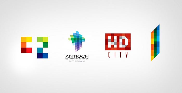
The concept had been initiated in 2010. Suffice to say, and it is still going strong, high and mighty even in 2020. When I say pixels, your brain must, in an automated manner, flash words like blocks and digital, right?
It’s because logos created using this technique do revolve around building blocks. It’s when numerous components are joined to construct a bigger picture made of small blocks.
The color pallet for pixels is, most often than not, towards a brighter and sharper side. The high heterogeneity and intensity of the colors help offer the logo a peculiar and distinctive edge.
Even for the rare cases where pixel-inspired logos using darker color shades, you can detect the variation of tones of even a single color. This can be seen through the example of the HD City logo. Even in the red part, I’m sure if you observe, you will see how some elements are of darker red shades. In comparison, other components include lighter shades of the same color.
If before, you wondered the hidden reason for the survival of pixels through a decade? Well, now, you know. Being unique and distinguished as you represent your brand does sound appealing, right?
Though, to master in using pixels as you come up with your logo, you must ensure you’re not opting for ordinary or universal tricks.
- Eight a.m. Brand Design, C2 MEDICAL SPA
- Eight-day Studio, Antioch Community Church Norman Corp.
- Gyula Nemeth, HD City
- Andrei D. Popa, City Tower
2. Wings
Every passing day brings logo creators to new challenges. The best of them is the one who can overcome all hurdles, open their wings with grace, and set off to meet new milestones.
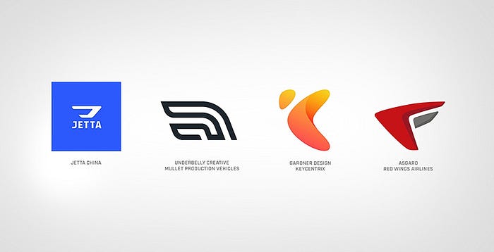
Wings inspired logos to represent flight, the take-off towards prosperity, elegance, and power as your logo captures the attention of your audience. They are simplistic in the first view, but you know what they say- sometimes, it’s the simple things that take the cake.
The wings face forward as if showing that they’re about to take off at high speed. To describe their structuring in the best way possible, I’ll say they represent the alphabet U. Not the standard U though, no.
The alphabet is tilted towards the side, with one leg a bit shorter than the other. Sometimes, the wings can also resemble letters F, P, J, and even D. It all depends upon how you format and align the wings to look according to your brand’s name.
Although the logo design was launched and adopted way back, before 2010 even, it started gaining popularity later during 2016 and is still a famous and trending design towards the end of 2019 and the start of 2020.
3. Bucky’s
Bucky’s is an intricate play of numerous triangles merged to form eccentric designs. It’s their charms that have made this trend be alive and thriving from 2010 to 2019.
Designers are the epitome of creativity. I know and salute how innovative they can be. It’s these designers who, after all, brought together a seemingly normal 2D shape to transform into identities. Each logo speaks its own story- the globe of diverseness.
The oldest trademark to date for one red triangle is owned by Bass Ale. Even if it was one triangle only, it still holds the title of being one of the most timeless geometric pieces. Fortunately for us, technical advancements and amazing brains of designers have enabled us to access more complex, fascinating, and impactful logos.
A star of the decade ending 2020, Bucky’s technique is, hands down, one of the most influential and adopted logo designs across the globe.
- Siren Design, Berkeley Estates
- Vladimir Isaev, Telecom Trade Company
- Dee Duncan, Razorfish
- Publicity Upstream, Nouveaux Marches de France

4. Circulate
The theme name speaks for itself- here, it’s all about circles; circles as the foundation of logo structuring. Did you know that this mere simple shape signifies so much?
From the circle of life to our mother earth, the whole theory of balance and center and even eternity and much more;
This is what circles represent. The circulate design trend was initially started in 2009. However, it earned its boom later, which continues to peak even as 2019 ended.
Designers primarily use a circulating trend to show change and transformation- an air of your brand meeting higher accomplishments and growths.
Circulate makes your logo become the center of evolution. It depicts revolution of the color scheme- from shade to shade or color to color, or from one step to another. Whatever you want your audience to perceive.
- Porkka & Kuutsa Oy, Central Union of Agricultural Producers & Forest Owners
- FutureBrand, MasterCard Worldwide
- Moving Brands, Mindshare
- Gardner Design, PBA Architects

5. Transparent Links
What makes transparent links so significant that they’re able to stand on their roots for a decade? This thought might go in your minds, no? Let me answer this for you.
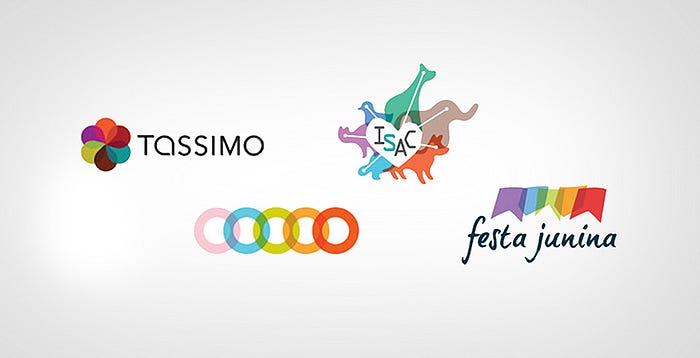
Sure, using various components to design a logo has been an old concept, but linking the components using transparent chains is quirky. The unusualness of the design has caused the trend to flourish even after almost ten years of its introduction in the early 2010s.
The invisible linking is not just meant to give your logo a more refined, neat, and sophisticated look. But, it also aims to create a well-knitted link between you, your brand, and your audience. The merging of a set of colors, the overlapping of colors this all represents more reliable connectivity.
The positive vibes of purity, content, and abundance the design gives have made it a favorite among logo designers. As for the color palette, it’s up to you, be it rainbow, set of darker or brighter colors. Whatever you use, you’re sure to come up with a strong logo, representing a sharp brand image, using transparent chaining.
6. Letters
Letter designing might sound like some recent development, but it isn’t. Letters as logos have been in the market since before 2010. However, it took that high rise in 2013, after which it’s still charting high even as 2019 finished.
Having the alphabet or number formatted in created fonts, using sharp and intense color pallet or even no color at all,
This is the trick to getting people unable to look away from your logo.
A nice play-off of graphic illusions is what you will have to focus on when using the letter designing trend. A little shadowing, a touch of highlighting, slight tilting to your message, and you’ve got for yourself a peculiar yet attention-stealing logo.

7. Shift
The concept of multi-layering in logo designing took designers in a storm when it got highlighted in 2010. It’s been since then till now; the trend has yet to show a downfall. Even in upcoming years, multi-layering can be seen as something being very much deployed by logo designers.
Selecting shapes and color palettes for logos becomes less of a complicated and time-consuming decision. Instead, you can now focus more on incorporating shadows, deciding how many highlights to add and what overlapping colors must be.
While your logo stays fixed, the added shadows and layering gives a 3D and moving effect. Also, because each color remains bright and clear, the overlapping becomes even more highlighted. Sharp and intense colors work the best with this technique, leaving long-lasting impressions and grabbing attention immediately.
- Asta form, Sheriff Studio
- Go, Welsh, Penn State Architecture
- Effusion Creative Solutions, musicplace.com
- Liska + Associates Communication Design, Becker and Becker

8. Doily
Doily-based logo designs are shaped to give off graceful yet unique and powerful vibes. Surrounded by lacey and floral design, the center of the logo is where you can either include alphabets or your brand name.
Ever since being first used in early 2010, the trend has become one of the timeless designing techniques. Each passing moment, more and more designers are adopting Doily for developing logos.
The simplistic yet soft, smooth, and luxurious look of the logo helps convey your brand’s message without any complexity. Although the logo might look delicate, it is nothing but. Doily represents a softer exterior while the interior remains protected by tracings and continues to deliver your brand name to everyone.
Easy on the eye, the epitome of clarity and intricacy, the trend is a mixture of geometry and flora that never fails to draw attention.
- Iperdesign, Inc., splurge dessert
- R&R Partners, Harrah’s
- Diagram, Eligiuz
- Gesture Studio, Isaias Gil

9. Monoline
Ultra-thin lines in a logo create a whole different persona. This is why, even in 2020, for ten years now, Monoline remains a luxurious logo designing trend.
It seems that logo designers have taken the quote of “Never too thin” to their hearts. It’s understandable, though, because extra thin lines do come with charms of their own.
Monoline mannerism, I can say, is a kind of peculiar play of typography. The logo’s written part, today, is usually in script or san serif font. These two fonts work wonders. High visibility and extreme individuality, two things that monoline offers that your logo can use to make people pay attention to.
Though, too much thin might become a hurdle for people with eyesight issues. This is why a thorough development and scaling is a need for you if you opt to employ this trend to create your logo.
- Vistaprint, Vistaprint
- FCB Durban, Oubaai
- RDQLUS Creative, Expeditiously Delicious
- Sommese Design, Dantes Restaurants

10. Half
Half is just that- half. This mannerism includes having your text half shown as the other half is erased.
The technique was introduced in 2007 though it wasn’t until 2012 onwards that it rose sharply to trend for the decade. The presence of half-chopped text is what compels the human mind to acknowledge the logo.
Today’s world is about having a unique offering point. What better uniqueness than half-cut text or numbers, right? Straightforward yet very artistic and inventive, the half technique will help you come up with some very successful logos.
- Design Firm: Fresh Oil Client: Spats Logo Concept
- Design Firm: Thomas Manss & Company Client: Cutcost.com
- Design Firm: Meme Design Client: Edge
- Design Firm: Miles Design Client: Urban Forward
11. Gradients
The star of the decade, I expect gradient designing to be one of the most trending logo designs for 2020 and years to come too.
It’s like designers understand that it’s not always about colors and transparency and extraordinary elements. Sometimes, the rule of the thumb is that you take the help of subtle creativity and distinct touch-ups. And that is what gradient technique includes.
The concept of minimalism is high in gradients. This allows you to transfer the statement directly. You need not allocate time to come up with the ideal color scheme or take the help of various elements to make your logo appear powerful.
The gradient is what they say, “Less is more.” Natural linear gradients and coming up with the right image is the key for this. You might need a lot of full attention to these factors. Adequate administration will hence ensure that the benefits you enjoy do surpass the efforts you put.
- Rylander Design, Baker Ave
- Signifly, Plesso
- Pixonal, Stallion
- Chermayeff & Geismar Inc., Women’s Tennis Association
12. Mosaics
The mosaic approach is when pixels, vibrant colors, and distinction all intersect together. As the colors all blend to form sharp outlines, the overall visualization of the logo enhances.
The intense color scheme is what makes Mosaic designs so captivating to the eye and mind. This is also why the trend has been going healthy for a decade and will continue to go so.
Before, when technology wasn’t as advanced, the mosaic design caused some hurdles, especially if made in black and white software. Today, however, you have access to better and advanced applications. They ensure your final results are more effective than you desired.
The start of this evolution can be credited to Altria’s multi-color squared grid logo of 2003. It was created using the then newly developed software and paved the way for further development.
- Team Y&R, Khalid Bin Haider Group
- Kommunikation & Design, Gartenwelt Manz
- dache, webmynd
- NATIONAL Public Relations, Greater Montreal

13. Texting
Imagery and words are one of the best visualization techniques. Though, to be innovative is the main point. You have to come up with a logo that has text written around icons- now that’s where success lies.
This kind of typography was introduced in 2009 and has managed to remain on top even as 2019 passed- very impressive.
All you need to do it select an adequate size and shape for the icon. It must be big enough to showcase your message with high visibility. Too big of the image is useless, sufficient to cover your text.
Texting is hence, a fantastic way to get your brand message across using your logo in a minimalistic way. The entertaining and welcoming air is a bonus.

Final word, I must say that following trend is not a good idea and your logo should be timeless.
But if you are sold on following the trends, it’s always prudent to follow the ones which lasted at least a decade.
So, next time you are working to create an exceptional and appealing logo for your brand, you know where to seek inspiration from.
The more your research, the better you’ll be able to select what design you want your logo to be based on.
Originally Published at Fullstop360.com/blog.
